Search all sites near me now
Search your favourite swimming spots

Borck at 400m d-s Queen St

In anticipation of urban growth to the south of Richmond, the lower reaches of Borck creek were widened (beginning March 2015) to carry increased flood flows. In conjunction with the widening work, new channels were created that incorporate the most comprehensive ecological design the Tasman region has seen to date for any stream diversion project.

Sampling programme change:

Beginning July 2016, Tasman District Council increased the frequency of sampling from quarterly to monthly and shifted from dry weather sampling (waiting at least three days after rain) to all-weather sampling. These changes should be considered when interpreting water quality trends for this site.

Borck Creek is located on the Waimea Plains close to Richmond and drains into the Waimea Inlet. It is fed from tributaries flowing off the Barnicoat Range. During summer, the mid reaches (from downstream of Paton Road to about 1.5km upstream from lower Queen St) go dry. This is due to high permeability of the stream bed and consequent loss of stream water to groundwater. The water re-emerges in a spring about 1.5km upstream of lower Queen St. Analysis of the spring water shows that it is very young and is a mix of groundwater from the Hope Unconfined Aquifer and surface water fed from the Barnicoat Range.

During the 1800s, large wetlands in the Borck Creek catchment were drained and the creek was straightened. From 2015, the creek was diverted into a newly constructed channel between approximately 300m above to 400m below Lower Queen St, Richmond. The primary driver for this diversion was to cater for increased floodwater from expanding urban development (with the resultant increase in proportion of land cover with impervious surface).

The new channel was designed to include a greater range of habitats for aquatic life than the old channel. While the old channel was straight, with little variation in water width and depth, the new channel has a natural meander with more width variation. Logs have also been embedded into the banks to provide instant cover for fish and about 300mm depth of clean cobble-dominated gravels placed on top of the new channel base to create habitat for fish and invertebrates. Wetland areas were created adjacent to the channel with swales dug to connect the wetlands to the main channel during high flows. Riparian trees and grasses were planted in July-August 2016 on elongated ‘islands’ adjacent to the channel. The islands help to keep the tree roots above the waterlogged soil. In time, the trees are anticipated to result in about 60% shading of the stream and should reduce the proliferation of filamentous algae.

The main water quality issues in Borck Creek are high nutrient concentrations, low dissolved oxygen levels in summer, and fine sediment deposits in the stream. The creek has elevated nitrate-N concentrations which fuels the excessive filamentous green algae growth (the highest coverage in Tasman District). When the hardness of the water is considered, however, this elevated nitrate is well below toxicity levels for native fish.

Water Quality
Water quality data for this site

This dashboard shows information on the data collected by the regional councils and unitary authorities for water quality indicators, analysed as state and trend. Select an indicator to see the historical monitoring data.

  • State

    State shows how the median of samples from this site compares to other sites.

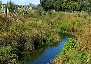
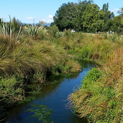
    This site is a {{siteDescription}} site. Currently showing the state of this site compared to:

  • The state is also represented by attribute bands in the National Policy Statement for Freshwater Management 2020 for some indicators.

  • Trend

    Trend shows how the quality of water is changing over time. Depending on the sampling history duration, five, ten and fifteen year timescales are available:

The state is also represented by attribute bands in the National Policy Statement for Freshwater Management 2020 for some indicators.


Can I trust this data?

The Cawthron Institute has worked alongside regional councils to verify the processes and methods used for data collection, laboratory analysis of samples collected and the statistical analysis and interpretation of the results presented.

If all Cawthron ticks are green, then you can trust this data. However, if one or more ticks are orange, then conclusions should be treated with some caution.

For more details on each tick, see our 'Can I Trust This Data?' Factsheet.

Can I trust the data for this site?
Data Collection

All samples were collected using approved field protocols and have been analysed in accredited laboratories. Therefore the data shown here has been collected and analysed following best practice.

State

This data is not sampled during high flows so the data shown only represents base flow conditions. Proposed national guidelines recommend sampling during both low and high flows to get a full picture of water quality.

Trend - SAMPLING FREQUENCY

The majority of trend calculations for this council are based on quarterly data. Sites with more data points generally have greater ‘statistical power’ for trends to be detected. Therefore, any trends shown here have less ‘statistical power’ for trend detection than trend calculations based on monthly sampling which is recommend by Davies-Colley et al. (2012).

Bacteria

E. coli
{{medianValue('ECOLI')}}
State
{{stateMsg(ECOLI.StateScore)}}
State
{{ECOLI.NofBand | uppercase}}
Attribute Band
N/A
Attribute Band
Trend
{{trendMsg(ECOLI)}}

Sample history at this site

Showing:
E. coli samples for Borck at 400m d-s Queen St
n/100ml

What is this graph showing me?

This graph is displaying E. coli concentrations over the selected time period. You can adjust this period by changing the dropdowns. These records form the basis for the state and trend indicators displayed on the dashboard. 

Find out about how State and Trend are calculated.

What do the attribute band icons mean?

The bands for E. coli are as outlined in the National Policy Statement for Freshwater Management 2020

A
For at least half the time, the estimated risk is <1 in 1000 (0.1% risk). The predicted average infection risk is 1%*.
B
For at least half the time, the estimated risk is <1 in 1000 (0.1% risk). The predicted average infection risk is 2%*.
C
For at least half the time, the estimated risk is <1 in 1000 (0.1% risk). The predicted average infection risk is 3%*.
D
20-30% of the time, the estimated risk is >=50 in 1000 (>5% risk). The predicted average infection risk is >3%*.
E
For more than 30% of the time, the estimated risk is >=50 in 1000 (>5% risk). The predicted average infection risk is >7%*.
* The predicted average infection risk is the overall average infection to swimmers based on a random exposure on a random day, ignoring any possibility of not swimming during high flows or when a surveillance advisory is in place (assuming that the E. coli concentration follows a lognormal distribution). Actual risk will generally be less if a person does not swim during high flows.

Suspended Fine Sediment

Clarity
{{medianValue('BDISC')}}
State
{{stateMsg(BDISC.StateScore)}}
State
{{BDISC.NofBand | uppercase}}
Attribute Band
N/A
Attribute Band
Trend
{{trendMsg(BDISC)}}

Sample history at this site

Showing:
Clarity samples for Borck at 400m d-s Queen St
metres

What is this graph showing me?

This graph is displaying Black Disc readings over the selected time period. You can adjust this period by changing the dropdowns. These records form the basis for the state and trend indicators displayed on the dashboard.  At some sites Black Disc is not measured - here the calculation of the state attribute band for Clarity (suspended fine sediment) has used Clarity measurements converted from Turbidity data (where available). 

Find out about how State and Trend are calculated.

What do the attribute band icons mean?

The bands for Clarity (suspended fine sediment) are as outlined in the National Policy Statement for Freshwater Management 2020

A
Minimal impact of suspended sediment on instream biota. Ecological communities are similar to those observed in natural reference conditions.
B
Low to moderate impact of suspended sediment on instream biota. Abundance of sensitive fish species may be reduced.
C
Moderate to high impact of suspended sediment on instream biota. Sensitive fish species may be lost.
National bottom line: Numeric attribute state by suspended sediment class: 1 = 1.34, 2 = 0.61, 3 = 2.22, 4 = 0.98
D
High impact of suspended sediment on instream biota. Ecological communities are significantly altered and sensitive fish and macroinvertebrate species are lost or at high risk of being lost.
Turbidity
{{medianValue('TURB')}}
State
{{stateMsg(TURB.StateScore)}}
Trend
{{trendMsg(TURB)}}

Sample history at this site

Showing:
Turbidity samples for Borck at 400m d-s Queen St
NTU
FNU

What is this graph showing me?

This graph is displaying Turbidity levels over the selected time period. You can adjust this period by changing the dropdowns. 

Yellow coloured bars on the graph represent turbidity values measured in NTU. These records form the basis for the state and trend indicators displayed on the dashboard. Some councils now also measure turbidity in FNU.  These data are shown as blue coloured bars and are not used by LAWA for the state and trend indicators.

Find out about how State and Trend are calculated.

Nitrogen

Total Nitrogen
{{medianValue('TN')}}
State
{{stateMsg(TN.StateScore)}}
Trend
{{trendMsg(TN)}}

Sample history at this site

Showing:
Total Nitrogen samples for Borck at 400m d-s Queen St
mg/L

What is this graph showing me?

This graph is displaying Total Nitrogen concentrations over the selected time period. You can adjust this period by changing the dropdowns. These records form the basis for the state and trend indicators displayed on the dashboard. 

Find out about how State and Trend are calculated.

Total Oxidised Nitrogen
{{medianValue('TON')}}
State
{{stateMsg(TON.StateScore)}}
Trend
{{trendMsg(TON)}}

Sample history at this site

Showing:
Total Oxidised Nitrogen samples for Borck at 400m d-s Queen St
mg/L

What is this graph showing me?

This graph is displaying Total Oxidised Nitrogen concentrations over the selected time period. You can adjust this period by changing the dropdowns. These records form the basis for the state and trend indicators displayed on the dashboard. 

Find out about how State and Trend are calculated.

Dissolved Inorganic Nitrogen
{{medianValue('DIN')}}
State
{{stateMsg(DIN.StateScore)}}
Trend
{{trendMsg(DIN)}}

Sample history at this site

Showing:
Dissolved Inorganic Nitrogen samples for Borck at 400m d-s Queen St
mg/L

What is this graph showing me?

This graph is displaying Dissolved Inorganic Nitrogen concentrations over the selected time period. You can adjust this period by changing the dropdowns. These records form the basis for the state and trend indicators displayed on the dashboard. 

Find out about how State and Trend are calculated.

Ammoniacal Nitrogen
{{medianValue('NH4')}}
State
{{stateMsg(NH4.StateScore)}}
State
{{NH4.NofBand | uppercase}}
Attribute Band (toxicity)
N/A
Attribute Band (toxicity)
Trend
{{trendMsg(NH4)}}

Sample history at this site

Showing:
Ammoniacal Nitrogen samples for Borck at 400m d-s Queen St
mg/L

What is this graph showing me?

This graph is displaying Ammoniacal Nitrogen concentrations over the selected time period.  These monitoring data have not been pH adjusted.  You can adjust this period by changing the dropdowns. These records form the basis for the state and trend indicators displayed on the dashboard. 

Find out about how State and Trend are calculated.

What do the attribute band icons mean?

The bands for Ammonia (toxicity) are as outlined in the National Policy Statement for Freshwater Management 2020

A
99% species protection level: No observed effect on any species tested.
B
95% species protection level: Starts impacting occasionally on the 5% most sensitive species.
National bottom line: Annual median 0.24 mg NH4-N/L. Annual 95th percentile 0.40 mg NH4-N/L (milligrams ammoniacal-nitrogen per litre). Note 1 mg/l = 1 g/m3
C
80% species protection level: Starts impacting regularly on the 20% most sensitive species (reduced survival of most sensitive species).
D
Starts approaching acute impact level (ie risk of death) for sensitive species.
Nitrate Nitrogen
{{medianValue('NO3N')}}
State
{{stateMsg(NO3N.StateScore)}}
State
{{NO3N.NofBand | uppercase}}
Attribute Band (toxicity)
N/A
Attribute Band (toxicity)
Trend
{{trendMsg(NO3N)}}

Sample history at this site

Showing:
Nitrate Nitrogen samples for Borck at 400m d-s Queen St
mg/L

What is this graph showing me?

This graph is displaying Nitrate Nitrogen concentrations over the selected time period. You can adjust this period by changing the dropdowns. These records form the basis for the state and trend indicators displayed on the dashboard.*  

Find out about how State and Trend are calculated.

*For sites where there are not enough Nitrate Nitrogen data available, Total Oxidised Nitrogen (TON) data have been used instead to calculate state and trend.  

What do the attribute band icons mean?

The bands for Nitrate (toxicity) are as outlined in the National Policy Statement for Freshwater Management 2020

A
High conservation value system. Unlikely to be effects even on sensitive species.
B
Some growth effect on up to 5% of species.
National bottom line: Annual median 2.4 mg NO3-N/L. Annual 95th percentile 3.5 mg NO3-N/L (milligrams nitrate-nitrogen per litre). Note 1 mg/l = 1 g/m3
C
Growth effects on up to 20% of species (mainly sensitive species such as fish). No acute effects.
D
Impacts on growth of multiple species, and starts approaching acute impact level (that is, risk of death) for sensitive species at higher concentrations (>20 mg/L)
This attribute measures the toxic effects of nitrate, not the trophic state. Where other attributes measure trophic state, for example periphyton, freshwater objectives, limits and/or methods for those attributes may be more stringent.

Phosphorus

Dissolved Reactive Phosphorus
{{medianValue('DRP')}}
State
{{stateMsg(DRP.StateScore)}}
State
{{DRP.NofBand | uppercase}}
Attribute Band
N/A
Attribute Band
Trend
{{trendMsg(DRP)}}

Sample history at this site

Showing:
Dissolved Reactive Phosphorus samples for Borck at 400m d-s Queen St
mg/L

What is this graph showing me?

This graph is displaying Dissolved Reactive Phosphorus concentrations over the selected time period. You can adjust this period by changing the dropdowns. These records form the basis for the state and trend indicators displayed on the dashboard. 

Find out about how State and Trend are calculated.

What do the attribute band icons mean?

The bands for Dissolved Reactive Phosphorus are as outlined in the National Policy Statement for Freshwater Management 2020

A
Ecological communities and ecosystem processes are similar to those of natural reference conditions. No adverse effects attributable to dissolved reactive phosphorus (DRP) enrichment are expected.
B
Ecological communities are slightly impacted by minor DRP elevation above natural reference conditions. If other conditions also favour eutrophication, sensitive ecosystems may experience additional algal and plant growth, loss of sensitive macroinvertebrate taxa, and higher respiration and decay rates.
C
Ecological communities are impacted by moderate DRP elevation above natural reference conditions. If other conditions also favour eutrophication, DRP enrichment may cause increased algal and plant growth, loss of sensitive macroinvertebrate and fish taxa, and high rates of respiration and decay.
D
Ecological communities impacted by substantial DRP elevation above natural reference conditions. In combination with other conditions favouring eutrophication, DRP enrichment drives excessive primary production and significant changes in macroinvertebrate and fish communities, as taxa sensitive to hypoxia are lost.
Total Phosphorus
{{medianValue('TP')}}
State
{{stateMsg(TP.StateScore)}}
Trend
{{trendMsg(TP)}}

Sample history at this site

Showing:
Total Phosphorus samples for Borck at 400m d-s Queen St
mg/L

What is this graph showing me?

This graph is displaying Total Phosphorus concentrations over the selected time period. You can adjust this period by changing the dropdowns. These records form the basis for the state and trend indicators displayed on the dashboard. 

Find out about how State and Trend are calculated.

Ecology
Ecological data for this site

This dashboard shows information on macroinvertebrate data collected by regional councils and unitary authorities.  Select an indicator to see the available historical results.

Select a time period

  • 10 years
  • 15 years

Macroinvertebrates

MCI
{{medianValue('MCI')}}
State

{{nofDisplayGradeEcology(MCI.NofBand)}}

Attribute Band
Trend
{{trendMsg(MCI)}}

Sample history at this site

Showing:
MCI samples for Borck at 400m d-s Queen St
MCI score

What is this graph showing me?

This graph is displaying MCI scores over the selected time period.  You can adjust this period by changing the dropdowns.  These records for the basis for the state and trends displayed on the dashboard.

Find out about how State and Trend are calculated.

What do the attribute band icons mean?

The bands for MCI are as outlined in the National Policy Statement for Freshwater Management 2020

A
Macroinvertebrate community indicative of pristine conditions with almost no organic pollution or nutrient enrichment.
B
Macroinvertebrate community indicative of mild organic pollution or nutrient enrichment. Largely composed of taxa sensitive to organic pollution/nutrient enrichment.
National bottom line: MCI score 90
C
Macroinvertebrate community indicative of moderate organic pollution or nutrient enrichment. There is a mix of taxa sensitive and insensitive to organic pollution/nutrient enrichment.
D
Macroinvertebrate community indicative of severe organic pollution or nutrient enrichment. Communities are largely composed of taxa insensitive to inorganic pollution/nutrient enrichment.
QMCI
{{medianValue('QMCI')}}
State

{{nofDisplayGradeEcology(QMCI.NofBand)}}

Attribute Band
Trend
{{trendMsg(QMCI)}}

Sample history at this site

Showing:
QMCI samples for Borck at 400m d-s Queen St
QMCI score

What is this graph showing me?

This graph is displaying QMCI scores over the selected time period.  You can adjust this period by changing the dropdowns.  These records for the basis for the state and trends displayed on the dashboard.

Find out about how State and Trend are calculated.

What do the attribute band icons mean?

The bands for QMCI are as outlined in the National Policy Statement for Freshwater Management 2020

A
Macroinvertebrate community indicative of pristine conditions with almost no organic pollution or nutrient enrichment.
B
Macroinvertebrate community indicative of mild organic pollution or nutrient enrichment. Largely composed of taxa sensitive to organic pollution/nutrient enrichment.
C
Macroinvertebrate community indicative of moderate organic pollution or nutrient enrichment. There is a mix of taxa sensitive and insensitive to organic pollution/nutrient enrichment.
National bottom line: QMCI score 4.5
D
Macroinvertebrate community indicative of severe organic pollution or nutrient enrichment. Communities are largely composed of taxa insensitive to inorganic pollution/nutrient enrichment.
ASPM
{{medianValue('ASPM')}}
State

{{nofDisplayGradeEcology(ASPM.NofBand)}}

Attribute Band
Trend
{{trendMsg(ASPM)}}

Sample history at this site

Showing:
ASPM samples for Borck at 400m d-s Queen St
ASPM score

What is this graph showing me?

This graph is displaying ASPM scores over the selected time period.  You can adjust this period by changing the dropdowns.  These records for the basis for the state and trends displayed on the dashboard.

Find out about how State and Trend are calculated.

What do the attribute band icons mean?

The bands for ASPM are as outlined in the National Policy Statement for Freshwater Management 2020

A
Macroinvertebrate communities have high ecological integrity, similar to that expected in reference conditions.
B
Macroinvertebrate communities have mild-to moderate loss of ecological integrity.
C
Macroinvertebrate communities have moderate-to-severe loss of ecological integrity.
National bottom line: ASPM score 0.3
D
Macroinvertebrate communities have severe loss of ecological integrity.
  • Taxonomic richness

    The median of the last 5 years of data

    {{medianValue("TaxaRichness")}}
    Taxonomic richness is the number of different taxa present in an ecological community identified to the best possible level.

    Taxa richness history at this site

    Showing:
    Taxa richness for Borck at 400m d-s Queen St
    Number of taxa

    What is this graph showing me?

    This graph is displaying Taxonomic richness over the selected time period.  You can adjust this period by changing the dropdowns.  These records for the basis for the state displayed on the dashboard.

  • Percent EPT richness

    The median of the last 5 years of data

    {{medianValue("PercentageEPTTaxa")}}
    EPT are macroinvertebrates that are sensitive to water pollution. These are Ephemeroptera (mayfly), Plecoptera (stonefly) and Trichoptera (caddisfly).

    EPT history at this site

    Showing:
    Percent EPT richness for Borck at 400m d-s Queen St
    EPT %

    What is this graph showing me?

    This graph is displaying percent EPT taxa over the selected time period.  You can adjust this period by changing the dropdowns.  These records for the basis for the state displayed on the dashboard.

Can I trust this data?

The Cawthron Institute has worked alongside regional councils to verify the processes and methods used for macroinvertebrate data collection, processing of the data in the laboratory, quality control in the field and laboratory and the statistical analysis and interpretation of the results presented.

For more details on each tick, see our 'Can I Trust this Data?' Factsheet.

Can I trust the data for this site?
Data Collection

Macroinvertebrates are sampled at this site as part of council's stream health monitoring programme.

Sampling - Frequency

Macroinvertebrate sampling is done annually or more frequently at this site.  Annual sampling provides enough data points for state and trend analyses to be calculated with sufficient statistical power for trend detection.

Sampling - Protocols

This site is a hard-bottomed site and appropriate sampling protocols have been applied.  Data shown here have been collected using current best-practice based on Stark et al. (2001).

Sampling - Habitat

Macroinvertebrate sampling is done in riffle habitat at this site. Data shown here are therefore following best practice as described in Stark et al. (2001).

Sampling - Stand-down period

This council does not collect any macroinvertebrate samples for up to two weeks after a flood greater than three times the median flow as recommended by Stark et al. (2001). Therefore, data collected at this site is following best practice.

Processing - Protocol

Samples at this site have been processed following sampling protocol P1 (semi-quantitative - coded abundance). Data shown here is not following best practice as described by Stark et al. (2001), but are still considered robust.

Quality Control - Field

Field data collected at this site had no quality control applied to it.

Quality Control - Lab

Data processed at this site has had one of the three Laboratory Quality Control Protocols (i.e., QC1, QC2,Q C3) applied. Data shown here is more robust than data with no laboratory QC applied.

See this site