Search all sites near me now
Search your favourite swimming spots

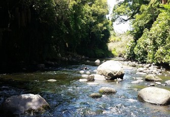
Mangorei Stream at SH 3 bridge u/s Waiwakaiho R

The Mangorei Stream is a major tributary of the lower Waiwhakaiho River, and is the only major tributary joining the Waiwhakaiho River downstream of significant water abstractions. This site is just above the confluence of the Mangorei and Waiwhakaiho, at an altitude of 90 metres above sea level and 18 kilometres downstream of the National Park boundary.

Macroinvertebrate data for Taranaki shown on LAWA may vary from some data reported elsewhere by the Taranaki Regional Council. This variation is because the level of macroinvertebrate identification used by the TRC has some minor differences from that used by other Councils and LAWA, affecting the taxonomic richness and % EPT taxa scores. Taranaki Regional Council also uses Macroinvertebrate Community Index (MCI) scores which have been modified to reflect the conditions experienced in Taranaki, while the scores shown here are based on the National MCI scores. For more details, the full state of the environment report is available at https://www.trc.govt.nz/council/plans-and-reports/environmental/environmental-monitoring-technical-reports/

Ecology
Ecological data for this site

This dashboard shows information on macroinvertebrate data collected by regional councils and unitary authorities.  Select an indicator to see the available historical results.

Select a time period

  • 10 years
  • 15 years

Macroinvertebrates

MCI
{{medianValue('MCI')}}
State

{{nofDisplayGradeEcology(MCI.NofBand)}}

Attribute Band
Trend
{{trendMsg(MCI)}}

Sample history at this site

Showing:
MCI samples for Mangorei Stream at SH 3 bridge u/s Waiwakaiho R
MCI score

What is this graph showing me?

This graph is displaying MCI scores over the selected time period.  You can adjust this period by changing the dropdowns.  These records for the basis for the state and trends displayed on the dashboard.

Find out about how State and Trend are calculated.

What do the attribute band icons mean?

The bands for MCI are as outlined in the National Policy Statement for Freshwater Management 2020

A
Macroinvertebrate community indicative of pristine conditions with almost no organic pollution or nutrient enrichment.
B
Macroinvertebrate community indicative of mild organic pollution or nutrient enrichment. Largely composed of taxa sensitive to organic pollution/nutrient enrichment.
C
Macroinvertebrate community indicative of moderate organic pollution or nutrient enrichment. There is a mix of taxa sensitive and insensitive to organic pollution/nutrient enrichment.
National bottom line: MCI score 90
D
Macroinvertebrate community indicative of severe organic pollution or nutrient enrichment. Communities are largely composed of taxa insensitive to inorganic pollution/nutrient enrichment.
QMCI
{{medianValue('QMCI')}}
State

{{nofDisplayGradeEcology(QMCI.NofBand)}}

Attribute Band
Trend
{{trendMsg(QMCI)}}

Sample history at this site

Showing:
QMCI samples for Mangorei Stream at SH 3 bridge u/s Waiwakaiho R
QMCI score

What is this graph showing me?

This graph is displaying QMCI scores over the selected time period.  You can adjust this period by changing the dropdowns.  These records for the basis for the state and trends displayed on the dashboard.

Find out about how State and Trend are calculated.

What do the attribute band icons mean?

The bands for QMCI are as outlined in the National Policy Statement for Freshwater Management 2020

A
Macroinvertebrate community indicative of pristine conditions with almost no organic pollution or nutrient enrichment.
B
Macroinvertebrate community indicative of mild organic pollution or nutrient enrichment. Largely composed of taxa sensitive to organic pollution/nutrient enrichment.
C
Macroinvertebrate community indicative of moderate organic pollution or nutrient enrichment. There is a mix of taxa sensitive and insensitive to organic pollution/nutrient enrichment.
National bottom line: QMCI score 4.5
D
Macroinvertebrate community indicative of severe organic pollution or nutrient enrichment. Communities are largely composed of taxa insensitive to inorganic pollution/nutrient enrichment.
ASPM
{{medianValue('ASPM')}}
State

{{nofDisplayGradeEcology(ASPM.NofBand)}}

Attribute Band
Trend
{{trendMsg(ASPM)}}

Sample history at this site

Showing:
ASPM samples for Mangorei Stream at SH 3 bridge u/s Waiwakaiho R
ASPM score

What is this graph showing me?

This graph is displaying ASPM scores over the selected time period.  You can adjust this period by changing the dropdowns.  These records for the basis for the state and trends displayed on the dashboard.

Find out about how State and Trend are calculated.

What do the attribute band icons mean?

The bands for ASPM are as outlined in the National Policy Statement for Freshwater Management 2020

A
Macroinvertebrate communities have high ecological integrity, similar to that expected in reference conditions.
B
Macroinvertebrate communities have mild-to moderate loss of ecological integrity.
C
Macroinvertebrate communities have moderate-to-severe loss of ecological integrity.
National bottom line: ASPM score 0.3
D
Macroinvertebrate communities have severe loss of ecological integrity.
  • Taxonomic richness

    The median of the last 5 years of data

    {{medianValue("TaxaRichness")}}
    Taxonomic richness is the number of different taxa present in an ecological community identified to the best possible level.

    Taxa richness history at this site

    Showing:
    Taxa richness for Mangorei Stream at SH 3 bridge u/s Waiwakaiho R
    Number of taxa

    What is this graph showing me?

    This graph is displaying Taxonomic richness over the selected time period.  You can adjust this period by changing the dropdowns.  These records for the basis for the state displayed on the dashboard.

  • Percent EPT richness

    The median of the last 5 years of data

    {{medianValue("PercentageEPTTaxa")}}
    EPT are macroinvertebrates that are sensitive to water pollution. These are Ephemeroptera (mayfly), Plecoptera (stonefly) and Trichoptera (caddisfly).

    EPT history at this site

    Showing:
    Percent EPT richness for Mangorei Stream at SH 3 bridge u/s Waiwakaiho R
    EPT %

    What is this graph showing me?

    This graph is displaying percent EPT taxa over the selected time period.  You can adjust this period by changing the dropdowns.  These records for the basis for the state displayed on the dashboard.

See this site