
This dashboard shows the latest results for air quality indicators collected by regional councils and unitary authorities. Indicators are shown against the National Environmental Standards for Air Quality (NES-AQ). Where no national standards exist for the air quality measurements shown, the data are compared against other guidelines (e.g. World Health Organization (WHO) 2021 guidelines, Ambient Air Quality Guidelines (AAQG)).
Select 'Show more information +' under a dashboard to see the current and historical monitoring data.
-
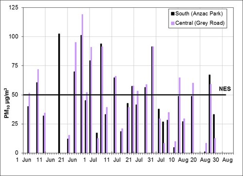
PM10 Data verified to 11/03/2025
-
Hourly average
{{data.DateTime | date:dateFormat}}hour to {{data.DateTime | date:'h:mm a'}}{{data.Text}}{{data.Units}}{{data.Compliance}}
-
Daily average
{{data.DateTime | date:dateFormat}}{{data.Text}}{{data.Units}}{{data.Compliance}}
-
Monthly average
{{data.DateTime | date:dateFormat}}{{data.Text}}{{data.Units}}{{data.Compliance}}
-
Annual average
{{data.DateTime | date:dateFormat}}{{data.Text}}{{data.Units}}{{data.Compliance}}
-
Exceedance
2025Year to date{{data.Text}}{{data.Units}}{{data.Compliance}}
Exceedance
2025Year to dateNo Data
Show more information Hide informationPM10 information
- Hourly
- Daily
- Monthly
- Annual
- Exceedances
- Show wind speed
- Show temperature
Months:-Showing:Guideline
Concentration (µg/m3)
Wind speed (km/h)
Air temperature (℃)
Guideline
What is this graph showing me?
This graph shows how concentrations of PM10 change on an hourly, daily, monthly or annual basis for the selected time period. The number of exceedance days can be viewed over the last 10 years or all years if available.
The PM10 daily average concentrations and exceedance days are compared to the National Standard (NES-AQ), and the PM10 annual average concentrations are compared to the WHO guideline. The standard and guideline limits are denoted by the red horizontal line. There are no guidelines for hourly or monthly average concentrations. For information about allowable exceedances and targets, and the limitations of data shown, see the factsheet on monitoring air quality in New Zealand.
The concentrations depend on local sources of emissions and weather conditions. Emissions from various sources change, depending on whether it's a weekday or the weekend or at different times of the year (e.g. emissions from home heating go up in the cold winter months). Still conditions often lead to high concentrations, as there is no wind to blow away the pollutants in the air. At some monitoring sites, the hourly temperature and wind data are available to explore the relationship between local weather conditions and PM10 concentrations. See this factsheet about why air quality is important and factors that influence air quality.
-
-
PM2.5 Data verified to 11/03/2025
-
Hourly average
{{data.DateTime | date:dateFormat}}hour to {{data.DateTime | date:'h:mm a'}}{{data.Text}}{{data.Units}}{{data.Compliance}}
-
Daily average
{{data.DateTime | date:dateFormat}}{{data.Text}}{{data.Units}}{{data.Compliance}}
-
Monthly average
{{data.DateTime | date:dateFormat}}{{data.Text}}{{data.Units}}{{data.Compliance}}
-
Annual average
{{data.DateTime | date:dateFormat}}{{data.Text}}{{data.Units}}{{data.Compliance}}
-
Exceedance
2025Year to date{{data.Text}}{{data.Units}}{{data.Compliance}}
Exceedance
2025Year to dateNo Data
Show more information Hide informationPM2.5 information
- Hourly
- Daily
- Monthly
- Annual
- Exceedances
- Show wind speed
- Show temperature
Months:-Showing:Guideline
Concentration (µg/m3)
Wind speed (km/h)
Air temperature (℃)
Guideline
What is this graph showing me?
This graph shows how concentrations of PM2.5 change on an hourly, daily, monthly or annual basis for the selected time period. The number of exceedance days can be viewed over the last 10 years or all years if available.
The PM2.5 concentrations and exceedance days are compared to the WHO guidelines. The guideline limits are denoted by the red horizontal line. There are no guidelines for hourly or monthly average concentrations. For information about allowable exceedances and targets, and the limitations of data shown, see the factsheet on monitoring air quality in New Zealand.
The concentrations depend on local sources of emissions and weather conditions. Emissions from various sources change, depending on whether it's a weekday or the weekend or at different times of the year (e.g. emissions from home heating go up in the cold winter months). Still conditions often lead to high concentrations, as there is no wind to blow away the pollutants in the air. At some monitoring sites, the hourly temperature and wind data are available to explore the relationship between local weather conditions and PM2.5 concentrations. See this factsheet about why air quality is important and factors that influence air quality.
-
-
Nitrogen dioxide Data verified to 24/03/2025
-
Hourly average
{{data.DateTime | date:dateFormat}}hour to {{data.DateTime | date:'h:mm a'}}{{data.Text}}{{data.Units}}{{data.Compliance}}
-
Daily average
{{data.DateTime | date:dateFormat}}{{data.Text}}{{data.Units}}{{data.Compliance}}
-
Monthly average
{{data.DateTime | date:dateFormat}}{{data.Text}}{{data.Units}}{{data.Compliance}}
-
Annual average
{{data.DateTime | date:dateFormat}}{{data.Text}}{{data.Units}}{{data.Compliance}}
-
Exceedance
2025Year to date{{data.Text}}{{data.Units}}{{data.Compliance}}
Exceedance
2025Year to dateNo Data
Show more information Hide informationNitrogen dioxide information
- Hourly
- Daily
- Monthly
- Annual
- Exceedances
- Show wind speed
- Show temperature
Months:-Showing:Guideline
Concentration (µg/m3)
Wind speed (km/h)
Air temperature (℃)
Guideline
What is this graph showing me?
This graph shows how concentrations of nitrogen dioxide change on an hourly, daily, monthly or annual basis for the selected time period. The number of exceedance hours can be viewed over the last 10 years or all years if available.
The nitrogen dioxide hourly average concentrations and exceedances are compared to the National Standard (NES-AQ). The nitrogen dioxide daily and annual average concentrations are compared to the WHO guidelines. The standard and guideline limits are denoted by the red horizontal line. There is no guideline for monthly average concentrations. For information about allowable exceedances and targets, and the limitations of data shown, see the factsheet on monitoring air quality in New Zealand.
The concentrations depend on local sources of emissions and weather conditions. Emissions from various sources change, depending on whether it's a weekday or the weekend or at different times of the year. Still conditions often lead to high concentrations, as there is no wind to blow away the pollutants in the air. At some monitoring sites, the hourly temperature and wind data are available to explore the relationship between local weather conditions and nitrogen dioxide concentrations. See this factsheet about why air quality is important and factors that influence air quality.
-